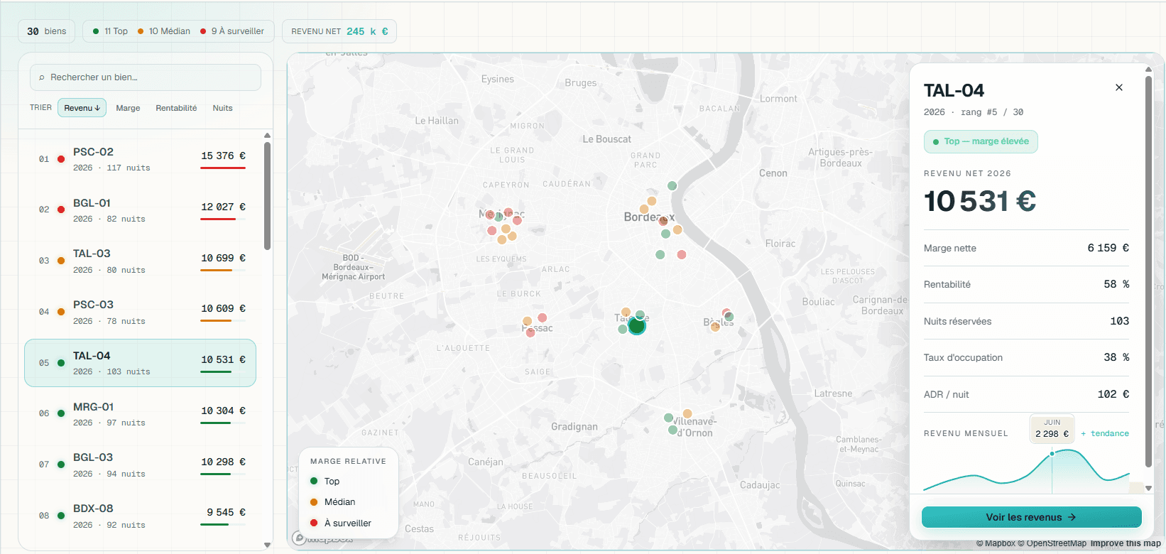
Why dashboards go unused
Most dashboards fail for a reason that has nothing to do with technology: nobody trusts the numbers on them. A director who doubts an indicator does not use it to decide: they ask for an export, and the dashboard becomes scenery.
The distrust nearly always has the same cause. The number is computed on data extracted yesterday, aggregated by a rule the tool wrote rather than the company, with no link to what it is made of. The natural reflex, “where does this figure come from?”, finds no answer on the screen.
The other failure is the average. Total revenue, average margin, average occupancy tell you nothing you can act on: they hide precisely what you are looking for, namely which unit, which site, which contract is dragging the result down. An average is an answer to a question nobody asked.
So a useful dashboard is defined by two things before any consideration of styling: it computes by the company’s rule, and every number stays clickable down to the lines behind it.
What the work covers
Your indicators, your definitions
Occupancy, net margin, cost price are defined at your company before they are computed. The definition is written into the system, visible, and it holds for everyone.
Every number traces to its source
Each amount opens onto the lines behind it: the entries, the jobs, the bookings. That is what turns a viewing screen into a decision tool.
Analysis at the useful grain
Profitability unit by unit, performance site by site, margin job by job. The total is still there, but it is no longer the only level you can read at.
Data brought together
What comes from operations, from accounting, from third-party tools: reconciled on stable identifiers, with discrepancies flagged rather than smoothed over. A silent reconciliation is a wrong one.
The exception, not the state
What moved, what falls outside the norm, what is approaching a threshold, brought to attention without anyone having to open the screen. A dashboard that requires a daily visit receives none.
Exports where they are legitimate
A board, a banker, an accountant needs a file. The export comes from the same calculation as the screen, which avoids the classic meeting where two versions of the same figure are circulating.
The signs you need more than an export
None of these is fixed by plugging a visualisation tool into the same data: they are fixed by reworking the calculation.
- The question “where does this figure come from?” has no answer on screen.
- Two departments present two versions of the same indicator.
- Monthly consolidation takes several days of rework.
- Decisions are made on averages that hide the extreme cases.
- A BI tool was installed, then abandoned for lack of trust.
- The information arrives late enough that the decision is already made.
Does your system live in a spreadsheet? Take the ten-sign test